
This post documents the code used to compare model iterations, as described in the post “Bootstrapping Model Data“. The code is written in Python 3.7.
Input
This code is currently comparing the results of 2 models. The results for each model are stored in a JSON file, which contains the model’s prediction for each image in my full image set.
An example of this JSON file follows:
[
    {
        'path': 'D:\\Roots\\oai-images\\00000000-0000-0000-0000-000000000000-roots-1.jpeg',
        'value': 'negative',
        'conf': 0.72014
    },
    ....
]
This snippet shows the stored prediction for one image. Each saved prediction includes:
- The
pathof the image used to make this prediction. - The
valueof the prediction made by the model. In this example, value will either be “positive” or “negative” depending on whether the image contains a picture of a bridge or not (respectively). - The confidence of the model’s prediction (
conf).
Output
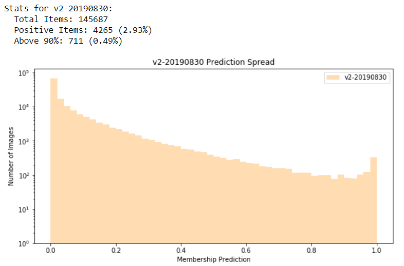
For each model, I’m outputting some very basic stats of the predictions (output_stats) and a histogram which shows the spread of the predictions (plot_histogram):
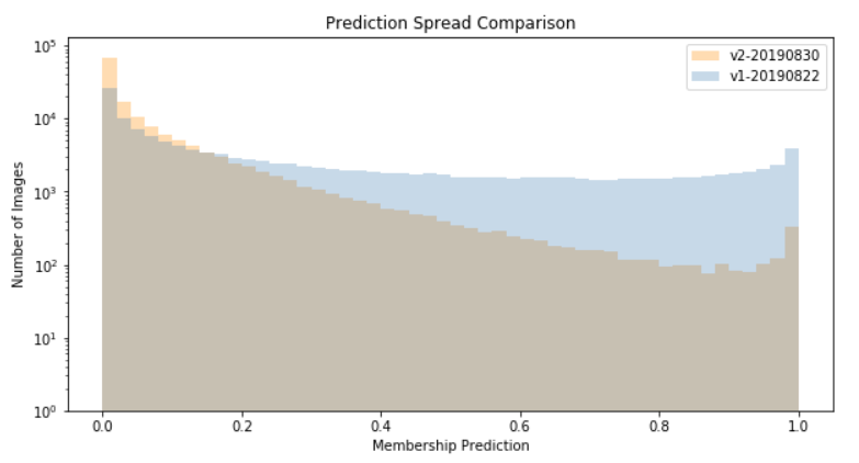
Next, I’m outputting a combined histogram of all models (plot_histogram):
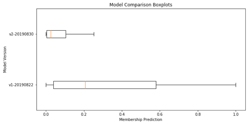
Finally, I’m also plotting the results of all models as a box plot (plot_boxplot):
Code
Here is the code used to generate these visualizations, in Python 3.7. Note that this is prototype, and not production-ready…
import matplotlib.pyplot as plt
import json

def get_json_from_path(file_path):
    json_data = json.loads(open(file_path).read())
    return json_data


def get_membership_value(item):
    if item["value"] == "negative":
        return 1 - item["conf"]
    else:
        return item["conf"]


def plot_histogram(data, title, xlabel, ylabel, label, color, log = False):
    plt.figure(figsize = (10, 5))
    _ = plt.hist(data, bins = 50, log = log, histtype = "stepfilled", alpha = 0.3, label = label, color = color)

    plt.legend(prop={'size': 10})
    plt.ylim(bottom=1)
    plt.title(title)
    plt.xlabel(xlabel)
    plt.ylabel(ylabel)
    plt.show()


def plot_boxplot(data, title, xlabel, ylabel, label):
    plt.figure(figsize = (10, 5))
    _ = plt.boxplot(data, labels = label, vert = False, showfliers = False)
    plt.title(title)
    plt.xlabel(xlabel)
    plt.ylabel(ylabel)
    plt.show()


def output_stats(data, name):
    total_count = len(data)
    pos_count = 0
    pos_gt90_count = 0
    for item in data:
        if item > 0.5:
            pos_count += 1
            if item >= 0.9:
                pos_gt90_count += 1

    print("Stats for {}:".format(name))
    print("  Total Items: {}".format(total_count))
    print("  Positive Items: {0} ({1:.2f}%)".format(pos_count, pos_count / total_count * 100))
    print("  Above 90%: {0} ({1:.2f}%)".format(pos_gt90_count, pos_gt90_count / total_count * 100))


v1res_path = r"D:\Roots\model-predictions\roots-Contains-Structure-Bridge-20190822-vl0p23661.json"
v2res_path = r"D:\Roots\model-predictions\roots-Contains-Structure-Bridge-20190830-vl0p29003.json"

v1_results = list(map(get_membership_value, get_json_from_path(v1res_path)))
v2_results = list(map(get_membership_value, get_json_from_path(v2res_path)))

data = (v1_results, v2_results)
names = ("v1-20190822", "v2-20190830")
colors = ("steelblue", "darkorange")

for i in range(0, len(names)):
    output_stats(data[i], names[i])
    plot_histogram(data[i], "{} Prediction Spread".format(names[i]), "Membership Prediction", "Number of Images", label = names[i], log = True, color = colors[i])

plot_histogram(data, "Prediction Spread Comparison", "Membership Prediction", "Number of Images", label = names, log = True, color = colors)

plot_boxplot(data, "Model Comparison Boxplots", "Membership Prediction", "Model Version", label = names)