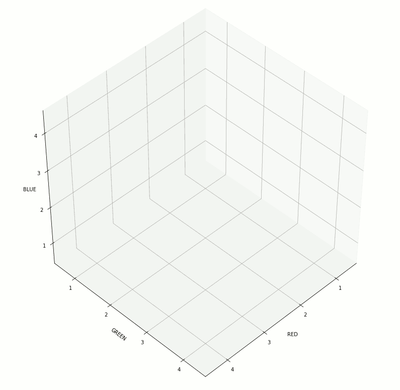
In support of some work related to color theory and linguistic relativity, I wrote some Python code to create visualizations of the RGB color space. A demo of some of the possible visualizations can be seen below (note, the animated GIF was created using GIMP):
The relevant code follows (Python 3.7):
%matplotlib inline

import matplotlib.pyplot as plt
from mpl_toolkits.mplot3d import Axes3D
from mpl_toolkits.mplot3d.art3d import Poly3DCollection
import random
import copy

def get_color_verts(r_rng, g_rng, b_rng):
    """
    Given a range in the RGB space, compiles list of vertices to be drawn.
    Used to draw the cubes representing each of the 64 defined colors.
    """
    r_min, r_max = r_rng
    g_min, g_max = g_rng
    b_min, b_max = b_rng
    # In order: r+g wrt-b, r+b wrt-g, g+b wrt-r
    verts = [[(r_max,g_min,b_min),(r_max,g_max,b_min),(r_min,g_max,b_min),(r_min,g_min,b_min)],
             [(r_max,g_min,b_max),(r_max,g_max,b_max),(r_min,g_max,b_max),(r_min,g_min,b_max)],
             [(r_max,g_min,b_min),(r_max,g_min,b_max),(r_min,g_min,b_max),(r_min,g_min,b_min)],
             [(r_max,g_max,b_min),(r_max,g_max,b_max),(r_min,g_max,b_max),(r_min,g_max,b_min)],
             [(r_min,g_min,b_max),(r_min,g_max,b_max),(r_min,g_max,b_min),(r_min,g_min,b_min)],
             [(r_max,g_min,b_max),(r_max,g_max,b_max),(r_max,g_max,b_min),(r_max,g_min,b_min)]
            ]
    return verts

def get_color_middle(r_rng, g_rng, b_rng):
    """
    Given a range in the RGB space, returns the color represented by the center point of the cube.
    Used to draw the color of a given cube.
    """
    r_min, r_max = r_rng
    g_min, g_max = g_rng
    b_min, b_max = b_rng
    return (((r_min+r_max)/2)/255.0, ((g_min+g_max)/2)/255.0, ((b_min+b_max)/2)/255.0)

def get_random(min_val, max_val):
    return random.randint(min_val, max_val)

def get_random_color(r_rng, g_rng, b_rng):
    """
    Given a range in the RGB space, selects a random point within the cube and returns the associated color.
    Used to draw random points within each shown cube.
    """
    val = [get_random(r_rng[0], r_rng[1]),
           get_random(g_rng[0], g_rng[1]),
           get_random(b_rng[0], b_rng[1])]
    return val

def adjust_points_per_cube(orig, color_list):
    """
    Depending on the number of colors which will be drawn, adjust the number of points shown in each.
    Used to balance performance.
    """
    ret = orig
    if orig == 0:
        if not color_list or len(color_list) > 8:
            ret = 50
        elif len(color_list) == 1:
            ret = 1000
        elif len(color_list) <= 3:
            ret = 500
        elif len(color_list) <= 8:
            ret = 300
    return ret

def get_filtered_color_list(all_colors, inc_colors):
    ret = []
    if not inc_colors:
        ret = copy.deepcopy(all_colors)
    else:
        for c in all_colors:
            if c["key"] in inc_colors:
                ret.append(c)
    return ret

def set_axis_limits(ax, show_full_grid, color_list):
    """
    Calculates the limits of each axis, depending on which subset of the RGB space is being shown.
    """
    if show_full_grid:
        ax.set(xlim3d = (0, 255), ylim3d = (0, 255), zlim3d = (0, 255))
    else:
        # Get min/max for chart limits (start w/inverse)
        r_min, r_max, g_min, g_max, b_min, b_max = [255, 0, 255, 0, 255, 0]
        for c in color_list:
            r_min = min(r_min, c["r"][0])
            g_min = min(g_min, c["g"][0])
            b_min = min(b_min, c["b"][0])
            r_max = max(r_max, c["r"][1])
            g_max = max(g_max, c["g"][1])
            b_max = max(b_max, c["b"][1])
            # ax.set(xlim3d = (r_min, r_max), ylim3d = (g_min, g_max), zlim3d = (b_min, b_max))
            ax.set(xlim3d = (r_min-5, r_max+5), ylim3d = (g_min-5, g_max+5), zlim3d = (b_min-5, b_max+5))

def draw_random_points(points_per_cube, color_list):
    for col in color_list:
        for i in range(points_per_cube):
            ci = get_random_color(col["r"], col["g"], col["b"])
            area = (15)**2
            ax.scatter(ci[0], ci[1], ci[2],
                       color = [ci[0]/255.0, ci[1]/255.0, ci[2]/255.0],
                       s = area)

def draw_cubes(ax, color_list, hilite_list, cube_alpha, hilite_alpha, edge_color):
    for c in color_list:
        p = Poly3DCollection(get_color_verts(c["r"], c["g"], c["b"]), alpha = cube_alpha)
        p.set_color(get_color_middle(c["r"], c["g"], c["b"]))
        if c["key"] in hilite_list:
            p.set_alpha(hilite_alpha)
        if edge_color:
            p.set_edgecolor(edge_color)
        ax.add_collection3d(p)

def set_axis_tickmarks(ax, x, y, z):
    ax.set_xticks(x)
    ax.set_yticks(y)
    ax.set_zticks(z)

def set_axis_ticklabels(ax, x, y, z):
    ax.set_xticklabels(x)
    ax.set_yticklabels(y)
    ax.set_zticklabels(z)

def create_color_list():
    """
    Creates a list of 64 "colors", by evenly dividing RGB space into 64 equal-sized cubes.
    This is accomplished by dividing each axis (R, G, B) into quarters.
    """
    # NOTE: A 3-character "key" is used to identify each of the 64 cubes. Used in filtering the display.
    keys_ = [["B", "G", "L", "M"],["A", "E", "I", "O"],["R", "S", "T", "V"]]
    rng_ = [[0, 63], [64, 127], [128, 191], [192, 255]]

    colors = []
    for idx_r, rng_r in enumerate(rng_):
        for idx_g, rng_g in enumerate(rng_):
            for idx_b, rng_b in enumerate(rng_):
                color = {}
                color["key"] = "{}{}{}".format(keys_[0][idx_r], keys_[1][idx_g], keys_[2][idx_b])
                color["r"] = rng_r
                color["g"] = rng_g
                color["b"] = rng_b
                colors.append(color)

    return colors

colors = create_color_list()

show_boxes = True       # Determines whether surfaces of each defined color cube is drawn.
show_points = True     # Set to True to draw random points of example shades in each selected cube.
points_per_cube = 0     # Number of random shades to draw. Set to 0 to use defaults, which balances for performance.
box_alpha = .1         # Alpha value for all shown colors.
hilite_alpha = 1.0      # Alpha value used for colors found in hilite_cubes list.
edge_color = [0, 0, 0]  # Color used to draw the edges of vertices.
show_full_grid = False   # Setting to False will focus space on just the shown cubes.
color_filter = []       # Keys of colors to be included. Set to empty [] to include all colors.
hilite_cubes = []       # Keys of colors to hilight (will use hilite_alpha value). Ignored if empty [].

points_per_cube = adjust_points_per_cube(points_per_cube, color_filter)

x_colors = []
x_colors = get_filtered_color_list(colors, color_filter)

fig = plt.figure(figsize = [14, 14])
ax = fig.gca(projection = '3d')

set_axis_limits(ax, show_full_grid, x_colors)
ax.set(xlabel = "RED", ylabel = "GREEN", zlabel = "BLUE")

ticks_ = [32, 96, 160, 223]
set_axis_tickmarks(ax, x=ticks_, y=ticks_, z=ticks_)

ticklbl_ = ["1", "2", "3", "4"]
set_axis_ticklabels(ax, x=ticklbl_, y=ticklbl_, z=ticklbl_)

if show_points:
    draw_random_points(points_per_cube, x_colors)

if show_boxes:
    draw_cubes(ax, x_colors, hilite_cubes, box_alpha, hilite_alpha, edge_color)

ax.view_init(45, 45)

# fig.savefig("demo-1.png", bbox_inches = "tight")
Lorem ipsum